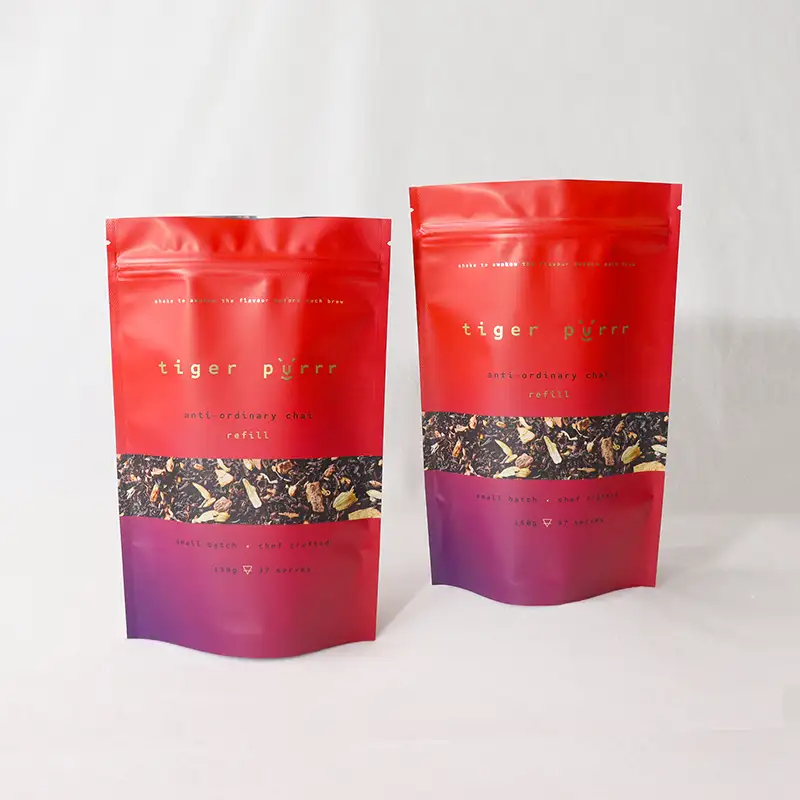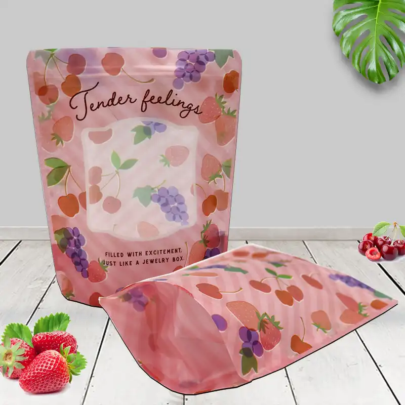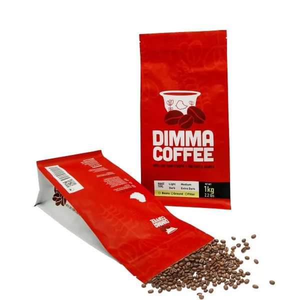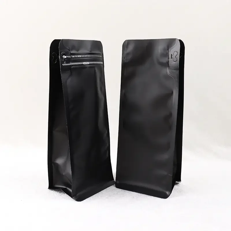

If you're staring at two sample pouches and wondering which one wins on the shelf, here's the short version: matte reads as premium, calm, and artisanal, while glossy reads as bright, energetic, and appetite-driven. Neither is universally better. The right pick depends on your brand story, your shelf environment, and the printing you plan to run. The matte vs glossy coffee bag debate is really a branding decision dressed up as a materials question.
Let's unpack it properly so you can choose with confidence, not guesswork.
The Quick Answer, Before We Go Deep
Choose matte if your coffee sits in the specialty, single-origin, or "slow craft" space and you want a sophisticated, understated feel. Choose glossy if you want your colors to pop under retail lighting, signal energy, or compete on a crowded grocery shelf where vibrancy grabs the eye.
Still torn? Many brands split the difference with a hybrid: a matte base with glossy spot varnish on the logo or beans. More on that trick later.
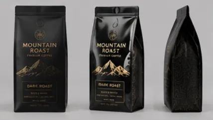
What Actually Changes Between the Two Surfaces
The finish is the top coating applied over your printed film. It changes how light behaves when it hits the pouch, and that single physical difference cascades into how customers perceive your product.
A soft, non-reflective coating scatters light, which mutes colors slightly and hides fingerprints. A high-shine coating reflects light, which deepens contrast and makes colors look saturated and lively.
- Light behavior: matte diffuses, glossy reflects.
- Color perception: matte softens tones, glossy intensifies them.
- Tactile feel: matte feels velvety, glossy feels smooth and slick.
- Fingerprint visibility: matte hides smudges, glossy shows them.
How Each Finish Performs on the Shelf: A Side-by-Side Look
When shoppers scan a shelf, they decide in roughly two to three seconds whether to reach for a bag. Retail eye-tracking studies published over the past few years consistently show that contrast and texture both influence that first glance. Here's how the two options stack up on the factors that matter most.
| Factor | Matte Finish | Glossy Finish |
|---|---|---|
| Perceived price point | Premium, artisanal | Approachable, mainstream |
| Color vibrancy | Muted, elegant | Bright, punchy |
| Shelf visibility (bright lighting) | Moderate, glare-free | High, but can catch glare |
| Fingerprint & scuff resistance | Higher | Lower |
| Photo-friendliness for social | Excellent, no reflections | Good, but reflections common |
| Best-fit coffee style | Specialty, craft, single-origin | Everyday blends, flavored, cold brew |
Notice there's no clear knockout. Each column wins in a different retail context, which is exactly why this choice deserves a few minutes of real thought.
The Case for Matte: Quiet Confidence
Matte has become the unofficial signature of specialty coffee. Walk into any third-wave roastery and you'll likely see soft-touch bags lining the walls. There's a reason that look spread so fast.
Where matte shines
- Premium signaling: the non-reflective surface reads as considered and high-end.
- Modern minimalism: it pairs beautifully with clean typography and lots of white space.
- Photograph-ready: no glare means crisp product shots for your website and social feeds.
- Smudge tolerance: handled bags still look clean on the shelf.
Where matte asks for care
Let's be honest about the trade-offs, because a full picture of matte finish coffee bag pros and cons helps you avoid surprises. Muted colors can look flat if your artwork relies on bold, saturated tones. Deep matte coatings sometimes show subtle scuffing on dark backgrounds during shipping. And matte can quietly recede on a busy shelf where every neighbor is screaming for attention.
Working with brands across North America, we've found that the most common mistake with matte is choosing it for a product that actually needed to shout, not whisper.
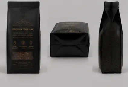
The Case for Glossy: Turn Up the Volume
Glossy is the classic choice for a reason. That reflective shine makes reds redder, browns richer, and gold foil practically glow. If your goal is to stop a distracted shopper mid-stride, shine does real work.
Where glossy wins
- Color impact: vibrant, saturated artwork looks its best.
- Appetite appeal: shine reads as fresh and energetic, great for flavored or ready-to-drink lines.
- Crowded-shelf visibility: reflectivity helps you cut through grocery clutter.
- Cost efficiency: glossy coatings are widely available and often the standard default.
Where glossy needs watching
Shine can catch overhead retail lights and create glare that hides part of your design. It also shows every fingerprint and scuff, which matters if bags get handled often. And in the specialty tier, a very shiny bag can accidentally read as "commodity" rather than "craft."
Which Finish Fits Your Brand Story?
This is the heart of the decision. The best coffee bag finish for branding is the one that matches the promise you're making to your customer before they even taste the coffee.
Ask yourself three simple questions:
- Where does my bag live? A boutique café shelf lit warmly favors matte. A fluorescent grocery aisle favors glossy vibrancy.
- What's my price tier? Higher-priced, story-driven coffee leans matte. Value and everyday blends lean glossy.
- Who am I talking to? A design-conscious millennial buyer often responds to matte; a broad family shopper often responds to bright, familiar shine.
Our in-house design team often helps brands who only have a rough idea of their positioning turn it into a finish decision that holds up on the shelf and on screen.
A Smart Middle Path: Hybrid Finishes
You don't always have to pick a side. One of the most effective techniques we see is a soft-touch matte base with glossy spot UV on select elements, like the logo, a coffee cherry illustration, or the origin name.
The contrast is striking. The matte body feels premium and calm, while the glossy accent catches light and pulls the eye exactly where you want it. It's a favorite move for brands that want sophistication and pop at the same time.
- Matte body + glossy logo = premium with a focal point.
- Matte body + foil stamp = luxury, gift-worthy feel.
- Glossy body + matte panel = readable info zone on a vibrant bag.
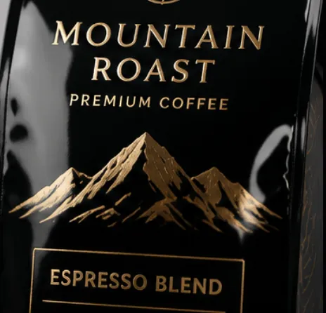
Print Quality: What Changes Under the Coating
Finish and print are tied together more than most brands expect. If you're comparing matte vs glossy coffee pouch printing quality, the key thing to know is that the coating sits over your ink and shifts how that ink appears.
On matte, fine gradients and small text stay legible without glare, but very dark, ink-heavy areas need proper coating thickness to avoid a chalky look. On glossy, saturated colors sing, but registration and dot gain must be controlled tightly, or the shine will amplify any printing flaw.
Because we hold FDA and ISO 22000 certifications, we recommend running a physical print proof before any full production. A digital mockup can't show you how light will actually play across the finished surface.
| Print Element | Better on Matte | Better on Glossy |
|---|---|---|
| Fine serif typography | ✔ Reads cleanly | Can catch glare |
| Bold saturated blocks | Slightly muted | ✔ Vibrant |
| Soft gradients | ✔ Smooth | Good, watch banding |
| Metallic / foil accents | Elegant, subtle | ✔ High shine |
| Photographic imagery | Refined | ✔ Punchy |
Don't Forget the Job the Bag Actually Does
Here's a truth that gets lost in the aesthetics conversation: the finish is only the outer layer. Underneath, your pouch has a harder job to do, which is keeping coffee fresh from roast day to the customer's kitchen.
Coffee is fragile. Oxygen, light, and moisture degrade aroma and flavor within days if the barrier is weak. The film structure beneath your matte or glossy coating determines whether that bright, floral top note survives shipping.
- Oxygen barrier: a strong barrier layer protects volatile aroma compounds that define your coffee's character.
- One-way degassing valve: lets CO2 escape after roasting without letting oxygen in.
- Light protection: matte and opaque films can help shield beans from UV that stales oil.
- Resealable closure: keeps freshness in after the first open, which customers now expect.
As a manufacturer that has produced packaging for 20+ years, we've seen beautiful bags fail because the barrier was an afterthought. A gorgeous finish over a leaky structure just delivers stale coffee in style.
What Small Roasters Should Weigh
If you're a smaller operation, the calculus shifts a little. Glossy coffee packaging for small roasters can be a practical starting point because it's forgiving on vibrant, expressive artwork and photographs well for direct-to-customer sales. But plenty of small roasters go matte to signal craft from day one.
The real constraint for smaller brands is usually order flexibility. You want a finish decision you can test without overcommitting. In our 6,800㎡ cleanroom facility, we regularly help newer brands run manageable first batches so they can learn what their shelf and customers respond to before scaling up.
A Simple Decision Checklist
Run through this before you sign off on artwork. If you check more boxes on one side, you have your answer.
Lean matte if you...
- Sell specialty, single-origin, or craft coffee
- Use minimalist, typography-led design
- Photograph your product often for social and web
- Want a premium, understated shelf presence
Lean glossy if you...
- Compete on a bright, crowded grocery shelf
- Use bold, saturated, colorful artwork
- Sell flavored, everyday, or ready-to-drink lines
- Want maximum visual pop and appetite appeal
Consider hybrid if you...
- Want premium feel plus a striking focal point
- Have foil or spot elements central to your logo
- Can't decide and want the strengths of both
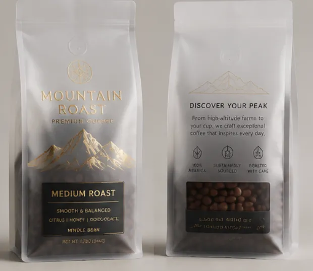
Bringing It All Together
So, matte vs glossy coffee bag which is better? The honest answer is that the winner is whichever finish tells your brand's truth most clearly on the shelf where it lives. Matte whispers craft and calm. Glossy shouts energy and appetite. Hybrids let you do both.
Start with your positioning, match the finish to it, and never let the coating outshine the barrier that actually protects your coffee. Get those two things aligned and your packaging will pull its weight at every touchpoint, from the retail shelf to the unboxing photo.
If you'd like a second set of eyes on your artwork and structure, the YLTPACK team is glad to talk it through and send physical samples so you can feel the difference before you commit. Reach us on WhatsApp at +86 182 1944 5665 or by email at [email protected]. As a source factory with our own design team, we're happy to help you weigh the options against your real shelf, not a theory.
Frequently Asked Questions
Does a matte finish cost more than a glossy one?
Costs vary by film structure, order size, and any special effects like spot UV or foil, so pricing is always quoted to your specific spec. Glossy is often the default coating, while soft-touch matte and hybrid effects can add steps. The smarter question is which finish earns its keep with your customers, and we're happy to walk through that with you.
Which finish photographs better for online sales?
Matte generally wins for photography because it eliminates glare and reflections, giving you clean, consistent product shots. Glossy can look stunning too, but you'll need controlled lighting to avoid hotspots. If most of your sales happen online, that alone often tips the scale toward a non-reflective surface.
Can I get both a matte and glossy look on the same bag?
Yes, and it's one of the most effective design moves available. A soft-touch matte base with glossy spot varnish on your logo or key artwork gives you a premium body with an eye-catching focal point. It's popular with brands that want sophistication and shelf pop at once.
Does the finish affect how fresh my coffee stays?
The finish itself is cosmetic, but it sits on a film that does the real work. Freshness depends on the oxygen barrier, a one-way degassing valve, light protection, and a good seal. Choose the look you love, then make sure the underlying structure protects aroma and flavor through shipping and shelf life.
I'm launching a new brand. How do I decide without overcommitting?
Order a physical proof or a smaller first batch so you can test how each finish reads on your actual shelf and in customer hands. Positioning comes first: specialty and craft usually lean matte, everyday and vibrant lines lean glossy. Testing before you scale keeps risk low while you learn what your audience responds to.