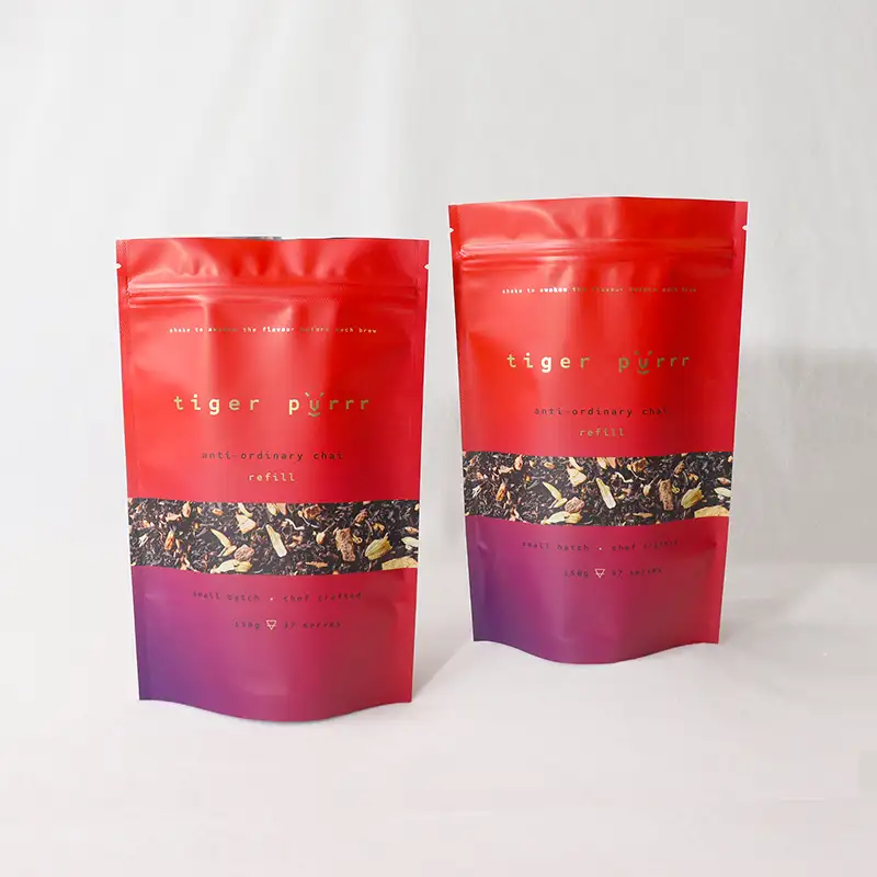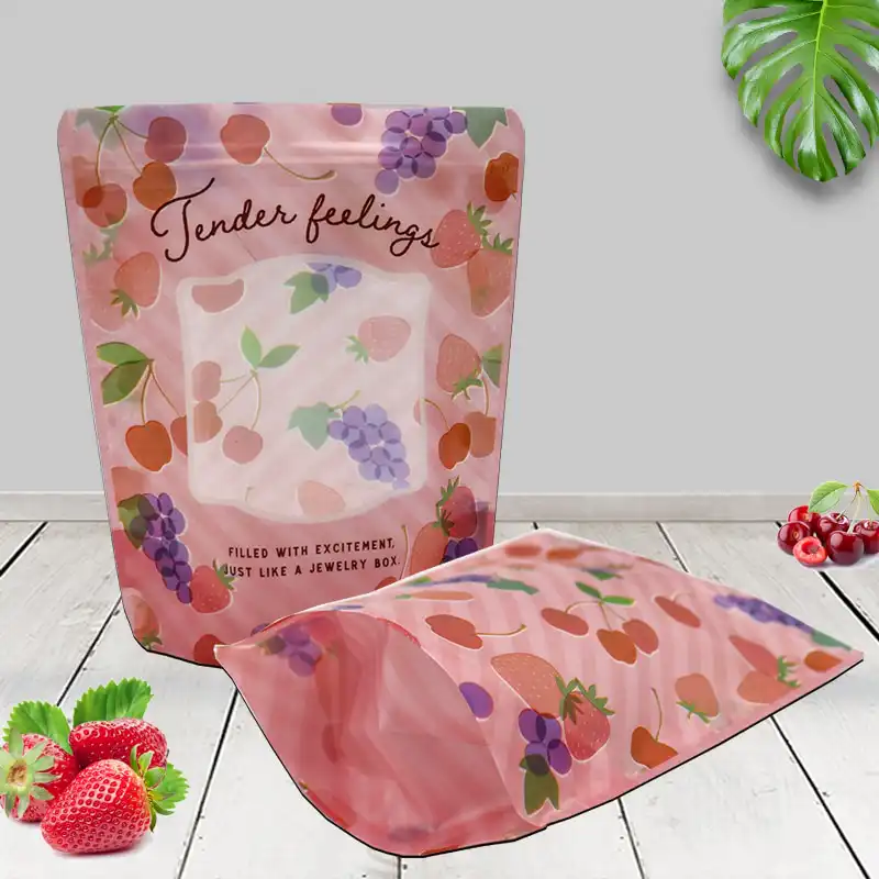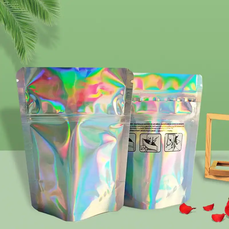

Short answer: In matte vs glossy snack packaging, neither finish wins every shelf. Glossy usually creates faster attention for bright, fun, impulse snacks, while matte often supports a more crafted, premium, or health-focused image. The finish that drives more sales depends on your snack category, price position, flavor design, retail lighting, and how clearly the pack communicates freshness.
If your chips, nuts, cookies, protein bites, candy, or dried fruit must compete on a crowded shelf, the right surface finish can change how shoppers feel before they read a single word. Let’s break it down in plain language, so you can choose with confidence before ordering custom packaging.
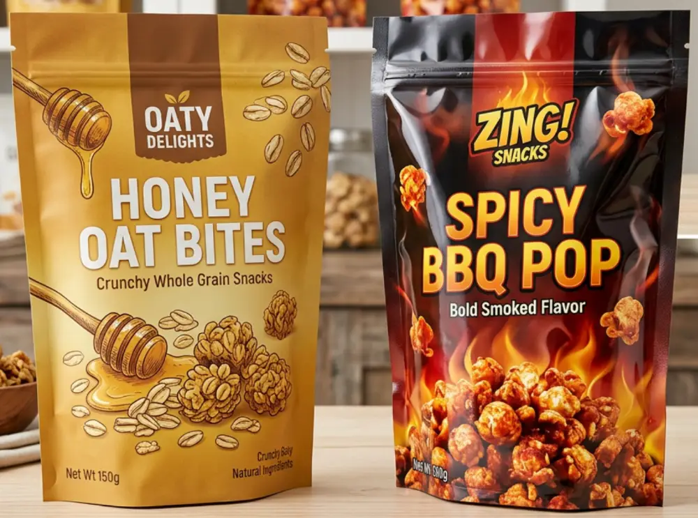
Quick Decision Table: Which Finish Fits Your Snack Brand?
If you are comparing matte vs glossy snack packaging pros and cons, start with the buying moment. A shopper does not evaluate packaging like a designer; they notice color, texture, shine, trust, and appetite appeal in seconds.
| Packaging Goal | Glossy Finish Often Works Better When... | Matte Finish Often Works Better When... | Practical Recommendation |
|---|---|---|---|
| Grab attention quickly | You use bold colors, fruit images, spicy flavors, or cartoon graphics | Your design uses strong contrast, clean typography, or dark backgrounds | Use glossy for high-energy snacks; use matte with spot gloss for selective emphasis |
| Look premium | You want a polished, vibrant, “fresh from the store” look | You want an artisanal, organic, clean-label, or giftable feel | Matte is often stronger for premium positioning, especially with simple artwork |
| Show food photography | The product image needs shine, sauce, seasoning, or vivid color | The image is secondary to brand story or ingredient transparency | Glossy or spot-gloss windows can make food look more appetizing |
| Reduce fingerprints and glare | The pack is not handled much before purchase | The pouch will be touched, passed around, or displayed under strong lights | Matte can improve readability and reduce harsh reflections |
| Control custom packaging cost | You need a standard, efficient finish for large runs | You accept a slightly higher finishing requirement for brand perception | Ask for side-by-side samples before finalizing the structure |
Why Finish Affects Snack Sales More Than Many Brands Expect
Snack buying is emotional. People may say they compare ingredients, size, and value, but the first trigger is usually visual: “That looks tasty,” “That looks healthy,” or “That looks worth trying.”
Gloss reflects light, so it can make colors appear brighter and food images appear juicier. Matte absorbs more light, so it can feel calmer, softer, and more refined.
As of July 29, 2026, one packaging trend remains clear across grocery, convenience, specialty food, and online snack brands: shoppers are not only buying flavor; they are buying a feeling of trust. Surface finish helps create that feeling before the zipper is opened.
As a manufacturer that has produced packaging for 20+ years, YLTPACK has seen many brands over-focus on artwork while treating finish as a last-minute choice. In real retail settings, that last surface decision can change whether a pouch looks cheap, clean, playful, natural, or gift-ready.
Glossy Snack Packs: Where They Win
Glossy packaging is energetic. It catches light, boosts saturation, and makes reds, oranges, yellows, greens, and metallic effects feel more alive.
That is why it is common for chips, candy, popcorn, cookies, spicy snacks, and children’s treats. These categories often rely on fast appetite appeal and strong flavor cues.
Glossy Works Well For
- Bold flavor launches: barbecue, chili, cheese, honey butter, sour cream, seaweed, and fruit flavors benefit from bright color.
- Impulse purchases: convenience-store snacks need instant visibility from a distance.
- Food photography: glossy surfaces can make seasoning, chocolate, fruit coating, or glaze look richer.
- Playful branding: mascots, bright patterns, and animated graphics often feel more dynamic on glossy film.
For chips and puffed snacks, a glossy bag can make flavor intensity feel stronger. If your selling point is crunch, spice, cheese, sweetness, or fun, shine may help your pack speak faster.
Where Glossy Can Fall Short
Gloss can create glare under store lighting, especially on curved stand-up pouches or pillow bags. If your key message is printed in small text, reflections can make it harder to read.
It can also feel less premium in categories where buyers expect natural ingredients, clean recipes, or artisanal production. For example, a glossy pouch for organic roasted nuts might look less calm and trustworthy than the same design in a soft-touch matte finish.
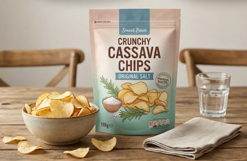
Matte Snack Packs: Where They Win
Matte packaging feels quieter, but not weaker. It signals restraint, craft, and intentional design.
This finish is popular for premium nuts, granola, protein snacks, freeze-dried fruit, plant-based treats, coffee snacks, bakery items, and clean-label chips. It often works especially well when the brand wants to communicate “better ingredients” rather than “louder flavor.”
Matte Works Well For
- Premium positioning: the reduced shine can make the pouch feel more refined in hand.
- Health-focused snacks: matte pairs well with simple ingredient lists, earthy colors, and transparent claims.
- Giftable products: chocolate-coated nuts, specialty cookies, and seasonal snacks often feel more elegant in matte packaging.
- Online sales: matte surfaces can photograph well when lighting is controlled, reducing harsh reflections.
Matte is also helpful when your design uses black, cream, kraft-style tones, muted green, deep blue, or minimalist typography. These choices can look more deliberate on a non-gloss surface.
Where Matte Can Fall Short
Matte can look too quiet if the artwork lacks contrast. A dull color palette on a low-sheen surface may disappear on a crowded shelf.
Some matte films or coatings may also show scuffing more easily during transport, depending on structure and handling. For heavier snack formats, like large nut bags or family-size pouches, abrasion resistance should be tested before mass production.
Matte vs Glossy Packaging for Chips and Snacks: Category Examples
The phrase matte vs glossy packaging for chips and snacks sounds simple, but category behavior is very different from one snack type to another. A spicy tortilla chip does not sell the same way as freeze-dried strawberries or keto granola clusters.
| Snack Category | Common Shopper Expectation | Finish That Often Fits | Why It Works |
|---|---|---|---|
| Potato chips and tortilla chips | Flavor impact, crunch, fun | Glossy or hybrid | Bright colors and seasoning images stand out quickly |
| Premium nuts | Quality, freshness, clean ingredients | Matte or soft-touch matte | Creates a calmer, higher-value feel |
| Protein snacks | Nutrition, trust, performance | Matte with clear contrast | Supports clean labels and serious claims |
| Kids’ snacks | Fun, color, excitement | Glossy | Boosts playful artwork and bright characters |
| Dried fruit | Natural, fresh, visible ingredients | Matte with window or spot gloss | Balances natural appearance with product appetite appeal |
| Cookies and bakery snacks | Indulgence, comfort, freshness | Glossy, matte, or hybrid | Depends on whether the brand feels playful, premium, or homemade |
In our 6,800㎡ cleanroom facility, we often test snack pouches under different lighting angles before final production. This helps reveal glare, color shift, scuff risk, and whether the front panel remains readable after filling.
Does Matte Look More Premium Than Glossy?
Many founders ask: does matte snack packaging look more premium than glossy? In many cases, yes, but only when the design supports it.
Matte does not automatically create value. If the pouch has weak typography, crowded claims, low-resolution images, or poor color contrast, it may simply look flat.
Premium perception comes from the full system: film structure, print quality, color control, zipper feel, pouch shape, barrier performance, and how the finish matches the product promise.
Premium Cues That Work Well With Matte
- Simple ingredient-focused claims, such as “roasted,” “sprouted,” “air-dried,” or “no added sugar.”
- Earth-tone, black, white, navy, dark green, or soft neutral color palettes.
- Small metallic details, spot gloss logos, or selective varnish on food images.
- Clear windows that show real product texture without making the whole pack shiny.
Our in-house design team often helps brands who only have a rough idea translate that idea into a printable pouch layout. One common suggestion is to keep matte packs simpler, because the finish already adds a tactile cue.
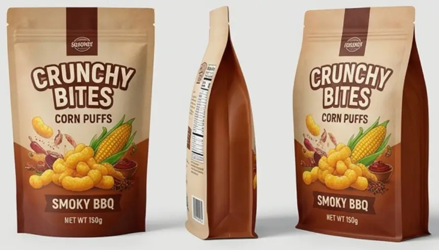
Cost Comparison: What Changes When You Choose a Finish?
Here is the honest version of a matte vs glossy food packaging cost comparison: the finish affects cost, but it is rarely the only cost driver. Material structure, order quantity, bag size, printing method, barrier level, zipper, valve, window, and special effects all matter.
Glossy finishes are often more straightforward when using common laminated films. Matte may require a matte film layer, matte varnish, soft-touch coating, or anti-scuff treatment depending on the target look and performance.
| Cost Factor | Glossy Finish | Matte Finish | Typical Impact on Decision |
|---|---|---|---|
| Print vibrancy | High color brightness with standard settings | May need color adjustment to avoid dullness | Matte artwork often requires more careful proofing |
| Surface treatment | Usually simpler for standard snack packs | May involve matte varnish, matte film, or soft-touch layer | Finish choice can change production steps |
| Scuff resistance | Scratches may be visible under light | Some matte surfaces need anti-scuff protection | Important for shipping, shelf stacking, and e-commerce |
| Perceived value | Strong for colorful mass-market snacks | Strong for premium, natural, or minimalist snacks | The better value is the one that supports your price position |
| Sampling importance | Recommended | Highly recommended | Matte color and texture should be checked physically |
Because custom packaging is built around your size, material, artwork, and functional needs, reliable suppliers should not push one fixed price before understanding your pack. A physical sample or digital proof can prevent expensive design regrets.
Food Safety and Freshness Matter More Than Shine
A beautiful pouch that fails to protect the snack will not build repeat sales. Finish affects perception, but barrier structure protects crunch, aroma, texture, and shelf life.
For chips and puffed snacks, oxygen and moisture control are critical because staleness shows quickly. For nuts, oxygen barrier matters because oils can oxidize and create rancid notes.
For coffee-flavored snacks or roasted products, aroma retention matters because smell is part of the eating experience. For dried fruit, moisture balance matters because texture can become too hard or sticky.
Because we hold FDA/ISO 22000 certifications, we recommend choosing the food-contact structure first, then selecting the visual finish. YLTPACK also works under ISO 9001 and GRS systems for brands that need documented quality and material responsibility.
Hybrid Finishes: Often the Smart Middle Ground
You do not always need to choose one extreme. Many snack brands use matte and glossy effects together to guide the shopper’s eye.
A matte pouch with a spot-gloss logo or glossy food image can feel premium while still showing appetite appeal. A glossy pouch with matte zones can reduce glare around nutrition claims or brand story areas.
Hybrid Ideas Worth Testing
- Matte background plus glossy flavor image: great for chips, cookies, dried fruit, and chocolate snacks.
- Glossy logo on matte pouch: adds contrast without making the whole pack shiny.
- Matte front with clear window: useful when real product appearance is a selling point.
- Soft-touch matte with metallic accent: suitable for premium nuts, seasonal snacks, and gift packs.
Hybrid finishing is especially useful when different parts of the pack have different jobs. The logo may need to feel refined, the flavor image may need to look delicious, and the nutrition claim may need to stay readable.
How to Choose the Right Finish Before Ordering in Bulk
If you are searching for the best finish for snack packaging matte or glossy, the practical answer is: test it against your real product, real shelf, and real buyer. A finish that looks great on a screen may behave differently on printed film.
Before approving a large custom run, review these points with your packaging supplier:
- Retail channel: convenience stores need stronger shelf impact; premium grocery may reward a calmer look.
- Snack texture: crunchy, coated, oily, roasted, or powder-seasoned products create different appetite cues.
- Brand promise: fun, natural, high-protein, indulgent, family-size, or giftable snacks each need a different visual tone.
- Lighting conditions: glossy packs may glare under bright retail lights; matte packs may need stronger contrast.
- Handling and shipping: e-commerce and warehouse stacking can expose surface scuffs faster than a neat showroom sample.
- Food protection: oxygen barrier, moisture barrier, seal strength, and zipper quality should be decided before decorative effects.
Working with snack brands across North America, we have found that the most common mistake is choosing a finish from a flat digital mockup only. Physical samples reveal hand feel, glare, color depth, and readability much more accurately.
A Simple Checklist for Your Next Snack Pouch Project
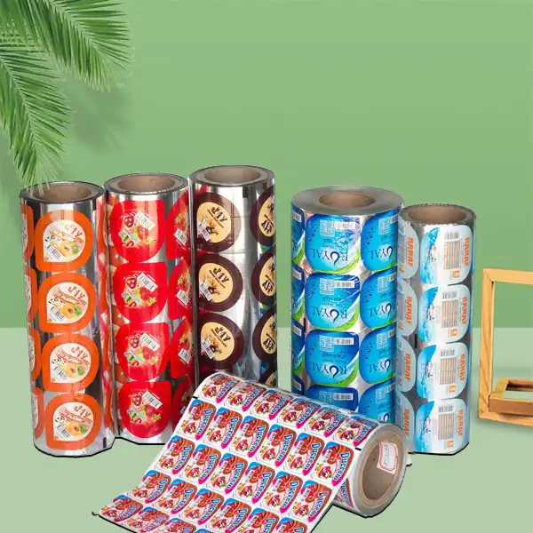
Use this checklist when discussing a new stand-up pouch, flat-bottom bag, roll film, or pillow bag. It keeps the conversation focused on sales performance instead of personal taste.
| Question | If Your Answer Is Yes | Finish Direction to Explore |
|---|---|---|
| Does the product rely on bright flavor excitement? | Spicy chips, candy, cheese snacks, fruit bites | Glossy or partial gloss |
| Is the snack positioned as clean-label or premium? | Nuts, granola, protein snacks, dried fruit | Matte, soft-touch matte, or matte with window |
| Will the pack be photographed often for online stores? | Website, marketplace, social media, influencer content | Matte or controlled spot gloss |
| Do you use large food images? | Cookies, chips, chocolate, fruit, coated snacks | Glossy image areas or hybrid finish |
| Will the product travel through long shipping routes? | Warehouse storage, cartons, export, courier delivery | Test scuff resistance before choosing final finish |
What We Recommend for Different Brand Stages
For a first snack launch, keep the finish decision simple. Choose the surface that makes your main promise easiest to understand from three steps away.
If you are refreshing an existing product, compare your current pouch against competitors on the same shelf. The goal may not be to look louder; it may be to look more trustworthy, easier to read, or more aligned with your new price point.
If you are expanding into multiple flavors, think about the whole family of products. A matte base with color-coded flavor bands, for example, can create consistency while still allowing each flavor to stand out.
For established snack lines, a hybrid finish can help create a stronger upgrade without changing the entire brand identity. This is useful when you want shoppers to notice improvement while still recognizing the product they already buy.
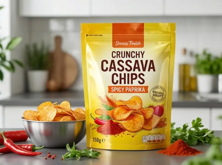
Final Verdict: Which Finish Drives More Sales?
Glossy finishes tend to perform well when the product needs energy, appetite appeal, and fast shelf visibility. Matte finishes tend to perform well when the product needs trust, quality perception, and a more thoughtful look.
The finish that drives more sales is the one that matches your snack’s promise. A fun spicy chip may lose impact in a dull pack, while a premium almond mix may lose credibility in a flashy one.
For most brands, the smartest path is not guessing. Compare printed samples, test the pouch under realistic lighting, check how it photographs, and confirm that the material still protects freshness.
YLTPACK can review your artwork, product type, bag size, and shelf goals before recommending a finish direction. If you are preparing a custom snack packaging project, you can reach the team at WhatsApp +86 182 1944 5665 or email [email protected] with your product details, target market, and design files.
FAQ
1. Is matte packaging always more expensive than glossy packaging?
Not always. Cost depends on the full pouch structure, film layers, print process, surface treatment, zipper, window, barrier needs, and order details.
Matte may require extra finishing steps in some projects, but the only reliable way to compare is to quote the same pouch size, structure, and artwork in both finishes.
2. Which finish is better for chips?
Many chip brands use glossy finishes because bright colors and food images help communicate crunch and flavor quickly. However, premium kettle chips, baked chips, or better-for-you chip lines may benefit from matte or hybrid finishes.
If your chip brand competes on bold flavor, test gloss. If it competes on ingredients, craft, or health positioning, test matte.
3. Will matte packaging protect snacks better than glossy packaging?
The finish itself is not the main protection factor. Freshness depends more on the film structure, oxygen barrier, moisture barrier, seal quality, and closure system.
You can have a high-barrier matte pouch or a high-barrier glossy pouch. The correct structure should be selected based on the snack’s oil content, moisture sensitivity, aroma, and target shelf life.
4. Can I combine matte and glossy effects on one snack bag?
Yes. Many brands use a matte background with glossy logos, flavor images, or highlight areas.
This approach can create strong contrast while keeping the overall pack refined. It is especially useful when you want both appetite appeal and a premium feel.
5. What should I send to a packaging supplier before choosing a finish?
Send your product type, bag size, filling weight, artwork file if available, target market, sales channel, shelf-life goal, and any requirements for zipper, window, valve, or recyclable materials.
If you are still early in the process, a rough sketch or reference image is enough to start the discussion. YLTPACK’s design and production teams can help turn that direction into a practical custom pouch plan.