
Flat Bottom Bag vs Stand Up Pouch: Which Has Better Shelf Presence?
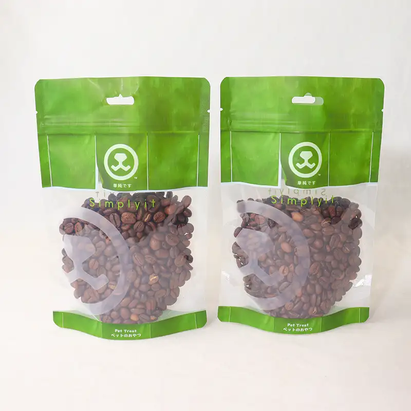
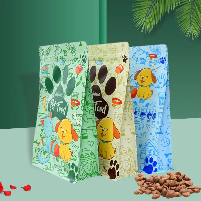
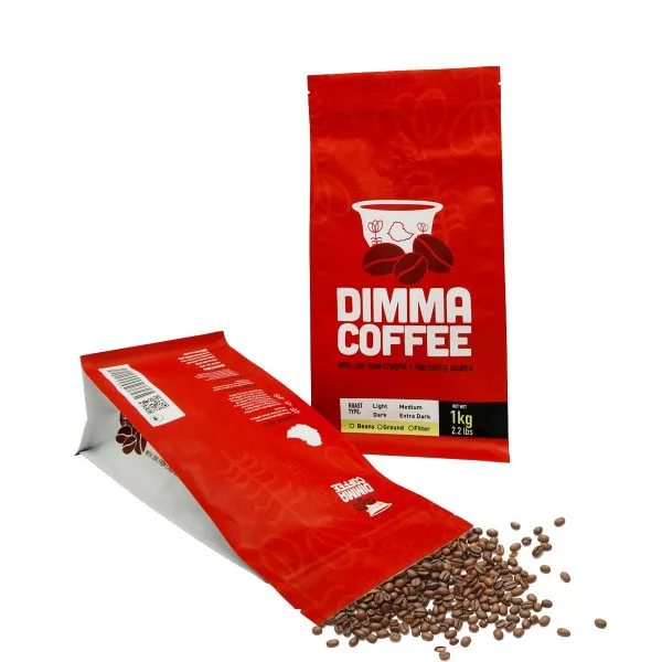
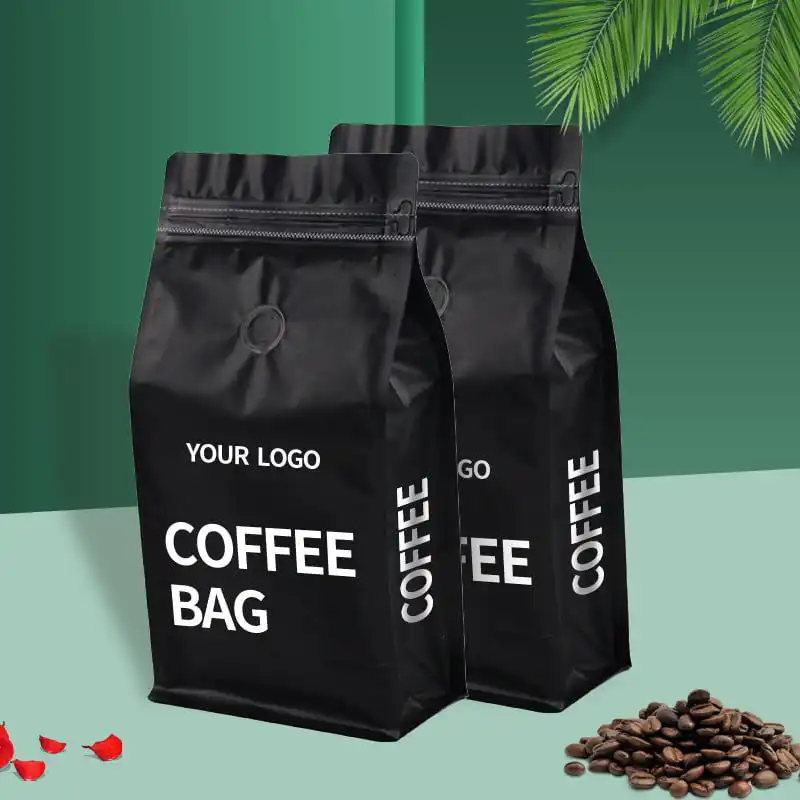
If you are comparing flat bottom bag vs stand up pouch shelf performance, the short answer is this: a flat-base format usually looks more structured and premium on crowded retail shelves, while a stand-up pouch often wins on flexibility, lighter weight, and cost-efficient display. The right choice depends on your product weight, brand style, retail channel, and how shoppers actually encounter your pack. Shelf presence is not only about “looking good”; it is about being seen fast, understood fast, and remembered.
After 15+ years analyzing packaging decisions, I have found that many brands ask the wrong first question. They ask, “Which one looks nicer?” A stronger question is, “Which one helps my product get noticed, stay upright, communicate value, and survive the supply chain?”
This guide breaks that down in plain English, with practical examples for coffee, snacks, pet food, beauty, grains, and more. I will also point out where each style performs well in real retail conditions, not just in studio mockups.
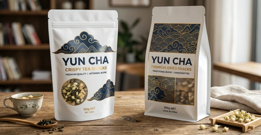
What “Shelf Presence” Really Means
Shelf presence is the combined effect of visibility, shape, stability, branding area, and shopper perception. A package can have great artwork and still disappear if it leans, wrinkles, or gets blocked by neighboring products.
In physical stores, shoppers often make first-pass judgments in seconds. That means the silhouette, front-facing panel, color contrast, and how neatly packs line up all matter as much as the printed design.
- Visibility: Can shoppers spot it from a few feet away?
- Readability: Is the logo and key message easy to read?
- Stability: Does it remain upright after handling?
- Perceived value: Does it look budget, practical, or premium?
- Consistency: Do multiple units create a clean block on shelf?
Quick Answer: Which One Usually Looks Stronger on the Shelf?
For many retail settings, the flat-base format has the stronger visual presence. Its boxier footprint, wider front panel, and straighter side walls often create a cleaner billboard effect.
The stand-up pouch can still perform very well, especially for lightweight products and casual categories. But when shelves are tightly packed or shoppers compare options side by side, a more rigid-looking structure often feels more reliable and more premium.
That said, categories matter. A trendy smoothie mix, refill beauty product, or travel snack may benefit from the softer, more flexible feel of a pouch, while coffee beans or pet treats may gain more authority from a squared profile.
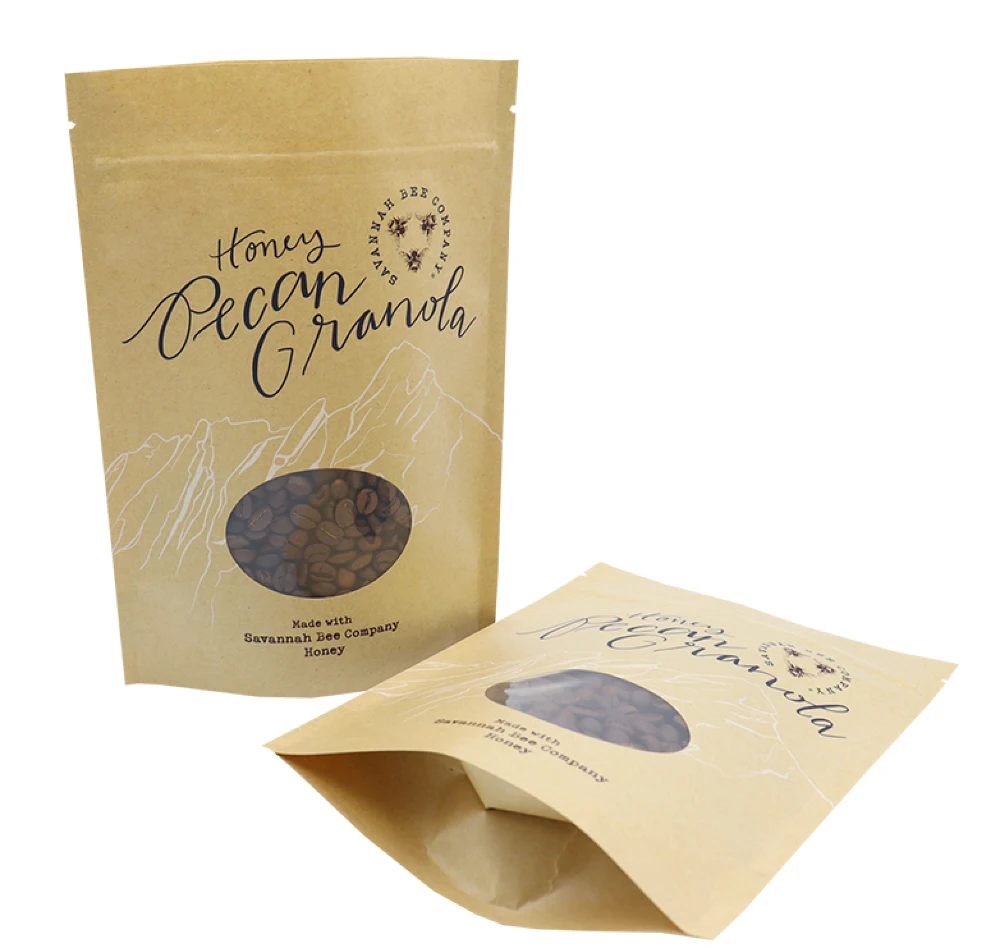
Shape and Front-Facing Area: The First Visual Advantage
Why flat-base packs often look more “organized”
These bags typically provide a broader front panel and clearer edges. On shelf, that can make logos look more centered, ingredient claims easier to scan, and the overall pack more substantial.
They also tend to create a more uniform row when several units sit together. That matters because retail shelves reward visual order.
Why pouches still work for many brands
Traditional pouches have a friendly, modern feel and can look less bulky. They often suit products positioned as convenient, natural, portable, or youthful.
If your artwork is bold and your product is light enough to stand cleanly, they can still deliver strong impact. This is especially true in wellness, confectionery, sample sizes, and refill concepts.
Bottom line on visual geometry
If your goal is a stronger “block effect” across multiple facings, the square-bottom structure usually has the edge. If your goal is a relaxed, flexible, easy-to-hold personality, the pouch may fit your brand story better.
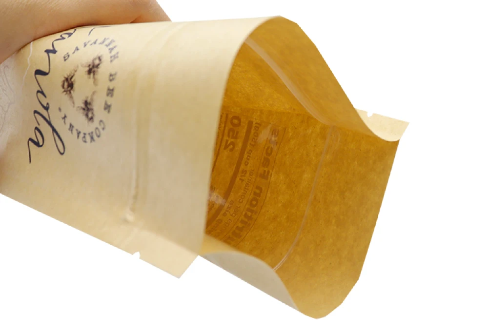
Shelf Stability: What Happens After Customers Touch the Pack?
This is where theory meets reality. A package may look great when merchandised by store staff, but after shoppers pick it up and put it back, weaker structures can tilt, slump, or rotate.
The phrase flat bottom pouch vs stand up pouch shelf stability comparison matters because stability directly affects shelf neatness over the full selling cycle, not just on day one. A more stable bag keeps your branding visible longer.
Working with brands across North America, we have found that one common mistake is choosing a pack based only on a digital mockup. In-store handling exposes shape weaknesses quickly, especially for heavier fills.
| Factor | Flat-Base Format | Stand-Up Pouch |
|---|---|---|
| Upright stability | Usually stronger | Depends heavily on fill weight and gusset design |
| Resistance after handling | Better shape recovery in many cases | More likely to shift or lean when partially emptied |
| Facing consistency | High | Moderate |
| Works well for heavier products | Yes | More limited |
| Lightweight convenience | Good | Very good |
Premium Feel vs Friendly Feel: What Are You Signaling?
Packaging shape sends a message before a shopper reads a single word. A squared, architectural form often suggests structure, quality, and a little more seriousness. A softer pouch often feels approachable, practical, and easy to use.
That difference matters by category. For specialty coffee, a crisp, upright shape can reinforce freshness and craftsmanship. For fruit gummies or trail mix, a softer profile may feel more fun and snackable.
As a manufacturer that has produced packaging for 20+ years, YLTPACK has seen a clear pattern: brands moving from generic shelf competition toward a more premium look often shift to a flat-base structure before they redesign graphics. Shape changes perception faster than many people expect.
Retail Display Performance by Product Category
Coffee
Coffee buyers often associate a stable, structured bag with quality and freshness. The larger front panel also helps communicate roast level, origin, tasting notes, and valve placement more clearly.
For coffee, oxygen barrier and aroma retention are not optional. Because we hold FDA/ISO 22000 certifications, we recommend balancing shelf impact with barrier performance and one-way degassing needs rather than focusing on appearance alone.
Pet food and treats
Pet owners increasingly check protein sources, feeding cues, and ingredient transparency. A broader front face helps those claims stay readable, especially when stores place products low on shelf.
Heavier fills also benefit from better base support. That usually gives the square-bottom option an advantage in this category.
Beauty and personal care
Refill packs, bath salts, masks, and sample kits can work beautifully in either format. If your brand leans toward social sharing and unboxing, the choice depends on whether you want a sleek premium look or a softer lifestyle feel.
Our in-house design team often helps brands who only have a rough idea turn the package shape into a stronger visual story. Sometimes the fastest win is not adding more graphics, but choosing a silhouette that already communicates the mood.
Rice, grains, and powdered foods
For products that need to stack, ship, and display in neat blocks, base stability matters a lot. Retail staff appreciate packs that stand easily and stay aligned.
In our 6,800㎡ cleanroom facility, one thing we see repeatedly is that transport and shelf performance are closely linked. If a format resists deformation in transit, it often presents better in store as well.
Branding Space: How Much Design Real Estate Do You Really Get?
Both styles offer printable area, but they do not present it in the same way. A flatter, more rectangular front often gives designers a simpler canvas for hierarchy: logo at top, product image center, benefit claims below.
A standard pouch may have a slightly more curved or flexible presentation depending on fill and material. That can work for casual products, but it may reduce clarity if your design includes many certification marks, flavor variants, or educational content.
If you are evaluating flat bottom bag vs stand up pouch shelf appeal, think beyond square inches of print. What matters more is how stable that panel stays once the bag is filled, shipped, and handled.
How Shoppers Read Packs in Real Stores
Most people do not study a shelf calmly. They glance, compare, reach, and move on. That is why a clean front panel and upright posture often beat overly clever design.
Research from retail attention studies continues to show that contrast, simplicity, and easy recognition improve first-pass noticeability. In practical terms, a package that stands straighter and wrinkles less often helps those design basics perform better.
When clients ask, which is better for shelf display flat bottom bag or stand up pouch, I usually answer: choose the one that preserves your design under normal abuse, not the one that looks perfect only in a rendering.
Cost, Freight, and Merchandising Trade-Offs
Shelf impact is important, but it is not the only factor in a buying decision. Materials, fill efficiency, case packing, and shipping density can all influence the final choice.
Stand-up pouches are often attractive for lighter products and brands watching freight closely. Flat-base styles may use more structure, but they can repay that with improved presentation, better lineup consistency, and a more premium feel.
| Decision Area | Flat-Base Format | Stand-Up Pouch |
|---|---|---|
| Premium shelf image | Strong | Moderate to strong |
| Lightweight portability | Good | Strong |
| Large front-panel readability | Strong | Moderate |
| Efficiency for simple product lines | Good | Strong |
| Performance for heavier fills | Strong | Moderate |
When a Stand-Up Pouch Is the Smarter Choice
Let’s be fair: the pouch is not the weaker option in every situation. It can absolutely be the smarter pick when convenience, lower material use, lighter fill weights, or a more casual brand tone matter more than a rigid shelf block.
- Single-serve snacks and candies
- Refill packs for home and beauty use
- Products sold online more than in stores
- Trial launches where flexibility matters
- Brands aiming for a soft, accessible personality
If your retailer uses hooks, baskets, dump bins, or compact secondary displays, a standard pouch may fit the environment better than a boxier shape.
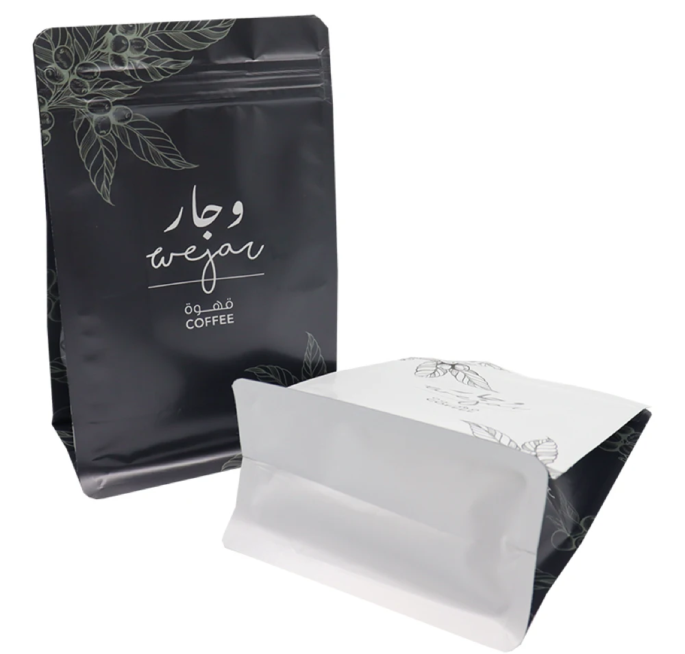
When a Flat-Base Format Is the Smarter Choice
This style tends to shine when product weight, premium perception, and orderly shelf presentation are priorities. It also works well when your pack must communicate many details without looking cluttered.
- Specialty coffee and tea
- Pet food and treats
- Protein powder and nutrition products
- Grains, rice, and dry pantry staples
- Giftable or premium snack lines
If your team is debating flat bottom bag or stand up pouch for retail shelf display, start by checking how much front-panel messaging you need and whether the product must remain upright after repeated handling.
A Simple Decision Checklist for Brand Owners and Buyers
Use this checklist before approving your next packaging structure:
- Is the product heavy enough that a softer pack may lean?
- Will shoppers compare it directly against premium competitors?
- Do you need a broad, stable front panel for claims and branding?
- Will the pack be handled often before purchase?
- Does your category reward a structured, high-value look?
- Are shipping and material efficiency more important than shelf authority?
If you answered “yes” to the first four questions, the flat-base option is often the safer shelf decision. If you answered “yes” mainly to the last question, the pouch may be the more practical route.
Common Mistakes That Hurt Shelf Presence
- Choosing shape based only on renderings, not filled samples
- Overloading the front panel with too many messages
- Ignoring how the pack looks after partial use
- Using low-contrast design on crowded shelves
- Forgetting that neighboring products affect visibility
- Testing only online presentation, not in-store lineup
The phrase best packaging for shelf presence flat bottom bag vs stand up pouch sounds like there should be one universal winner. In reality, the strongest result comes from matching shape, product behavior, channel, and brand story.
Final Verdict
For pure shelf presence, the flat-base format usually has the advantage. It tends to stand straighter, present graphics more cleanly, and create a stronger premium impression in side-by-side retail comparison.
But that does not make the stand-up pouch the wrong answer. For lighter products, convenience-driven categories, and brands that want a softer, more approachable feel, it can perform very well and sometimes fit the business case better.
If you are deciding between the two, ask for filled samples, place them next to competing products, and evaluate them after handling, transport simulation, and partial emptying. That process reveals more than a digital mockup ever will.
For brands that want a grounded packaging discussion, YLTPACK can help review structure, barrier needs, and visual direction based on your actual product and sales channel. You can reach the team at WhatsApp: +86 182 1944 5665 or [email protected].
FAQs
Does a flat-bottom bag always sell better than a stand-up pouch?
No. Better shelf presence does not automatically mean better sales. Price point, flavor, brand trust, claims, and store placement all matter too. The more structured format often improves visibility and perceived value, but the product still needs the right message and positioning.
How can I test which format is right for my product before a large order?
Request prototype samples with your actual fill weight, then place them on a mock shelf next to competing products. Check front-panel visibility, stability after handling, and how the pack looks after opening and resealing. If you need support with structure or artwork direction, a supplier with manufacturing experience and an in-house design team can help you avoid expensive trial-and-error.