
Matte or Gloss? Let's Settle This
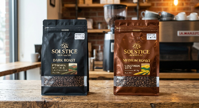
Shelf Performance: A Side-by-Side Look
Theory is nice, but you're buying for a real shelf. Here's how the two finishes compare on the things that actually move units.
| Factor | Matte Finish | Gloss Finish |
|---|---|---|
| Perceived price tier | Higher, craft-leaning | Mid to mass, energetic |
| Color vibrancy | Subdued, sophisticated | Punchy, saturated |
| Visibility under bright light | Soft, low glare | High, eye-catching |
| Fingerprints and scuffs | More visible on dark colors | Visible smudges, but easy to wipe |
| Hand feel | Velvety, tactile | Smooth, slick |
| Photo-quality imagery | Slightly softened | Sharp and bright |
Notice there's no clear winner. A specialty roaster chasing a refined look leans one way; a brand selling flavored blends to a younger crowd often leans the other.
The Layer Under the Finish Matters More Than the Finish
Here's something easy to overlook. The finish sits on top of a structure made from several bonded layers, and that structure is what actually protects your beans. The choice of coffee package material decides whether your aroma survives shipping and weeks of shelf time.
Oxygen, light, and moisture are the enemies of fresh roast. A good barrier layer blocks all three, while a one-way valve lets the natural gases from fresh beans escape without letting air back in. Get this part wrong and the prettiest pouch in the world still delivers stale coffee.
This is where production quality quietly does the heavy lifting. Our pouches are assembled in a 6,800㎡ cleanroom under FDA and ISO certified processes, because barrier consistency and food safety can't be left to chance. A flawless print over a leaky seal is a refund waiting to happen.
Matching the Finish to Your Brand Story
The smartest way to decide is to stop thinking about which looks nicer and start thinking about what your customer expects to feel. Let's break it down by situation.
When the Flat Look Wins
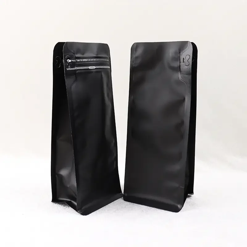
Choose a low-sheen surface if you're positioning as single-origin, small-batch, or design-forward. It pairs beautifully with minimalist layouts, earthy palettes, and a lot of negative space. If your buyer is paying a premium and expects something that feels handmade, matte coffee packaging quietly signals that value.
It also photographs well for online listings without harsh glare, which helps if you sell direct.
When the Shiny Look Wins
Go reflective when your product is fun, bold, or built around vivid imagery. Flavored roasts, seasonal blends, and gift-oriented lines often benefit from the energy. The same logic applies to gloss finish coffee bags aimed at supermarket aisles where you're competing against a wall of color.
If your design relies on bright photography or metallic accents, the extra shine makes those details sing.
The Hybrid Move Most Brands Miss
You don't have to pick a side. A favorite trick is a flat base with selective shiny accents, called spot gloss. Imagine a matte bag where only the logo and a single coffee cherry catch the light.
That contrast feels intentional and expensive. It's one of the cleaner ways to build premium coffee bag designs without raising your whole budget, since the effect is concentrated where it earns attention.
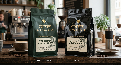
Practical Factors Buyers Forget Until It's Too Late
Aesthetics get all the attention, but a few quiet details decide whether you're happy six months in.
- Scuff resistance: Dark flat surfaces can show wear during transit. A protective over-layer solves most of it, so ask how the surface is sealed.
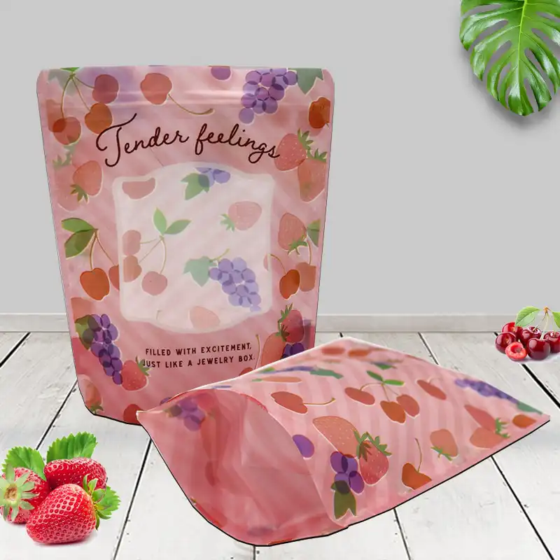
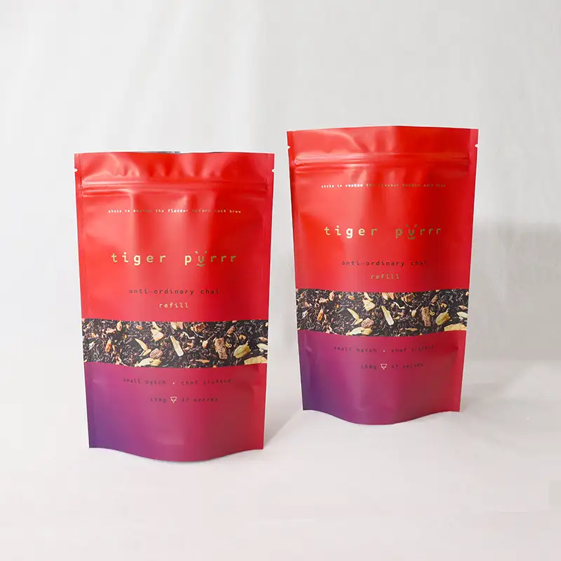
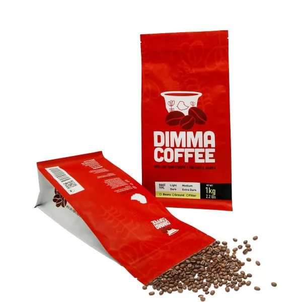
- Format fit: The finish behaves differently across shapes. A flat-bottom box pouch, a side-gusset bag, and stand up coffee pouches with zipper each catch light at different angles.
- Reseal hardware: Tear notches, zippers, and valves all need to bond cleanly to the surface you choose.
- Print method: Fine gradients and tiny text reproduce differently depending on the coating, so proof before you commit.
None of these are dealbreakers. They're just the kind of thing worth raising with whoever produces your order, ideally before the press runs.
Format and Finish Should Be Decided Together
People often lock in a bag shape, then think about finish as an afterthought. Flipping that order saves headaches. The structure influences how light hits the surface, how much print area you get, and how the finish wears.
| Format | Best-fit vibe | Finish that tends to suit it |
|---|---|---|
| Flat-bottom box pouch | Premium, retail-ready | Flat base with spot accents |
| Stand-up pouch | Versatile, everyday | Either, depending on palette |
| Side-gusset bag | Traditional, wholesale-friendly | Flat for craft, shiny for bold |
| Flat pouch / sample size | Trial and gifting | Shiny for vibrancy |
If you're ordering custom printed coffee bags wholesale, deciding format and finish at the same time keeps your artwork from being squeezed or your costs from creeping up later.
Where Sustainability Fits Into the Choice
More buyers ask about eco-friendly options every year, and finish plays into that conversation. Recyclable and plant-based structures have come a long way, and a soft, paper-like surface naturally complements an earthy, low-waste message.
If your customers care about footprint, look at compostable coffee bags with degassing valve options that still protect freshness. The matte aesthetic tends to align with that story, though a light sheen is perfectly possible on greener structures too.
A heads-up worth giving: some compostable films accept finishes differently than conventional ones. Always proof a physical sample so the surface looks the way you imagined.
Getting It Right Before You Place a Bulk Order
This is the step that separates a confident launch from an expensive lesson. Looking at a finish on a screen tells you almost nothing. Light, texture, and feel only make sense in your hand.
The pattern that shows up again and again is brands that skip physical proofing and end up regretting it. Our in-house design team works through digital mockups and printed samples first, so you can hold the real surface, rub it, and check how your logo catches light before anything scales up.
A practical sequence that works well:
- Define your shelf and customer first, then shortlist a finish direction.
- Lock in structure and barrier needs alongside the look.
- Approve a digital proof, then a physical sample under real lighting.
- Confirm reseal and valve placement on that sample.
- Only then move to your full run.
That order costs you a little time up front and saves you a great deal later.
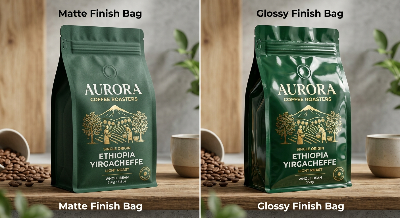
A Quick Word on Kraft and Natural Looks
Worth a mention because it confuses a lot of first-time buyers. A natural paper look isn't a separate finish so much as a base surface, and it usually wears a low-sheen coating on top. If you love that rustic feel, ask specifically for kraft coffee packaging bags resealable so freshness and convenience aren't sacrificed for aesthetics.
The natural texture reads as honest and grounded, which suits origin stories and farm-direct messaging especially well.
Final Take
There's no universal answer, and anyone who tells you otherwise is guessing. A flat, non-reflective surface signals craft and calm and tends to feel more premium in hand. A reflective surface brings energy, color, and visibility, which can be exactly what a bold or playful brand needs.
Match the finish to your customer, decide it alongside your structure and format, and always hold a physical sample before you commit. Do those three things and the decision stops feeling like a gamble.
If you're weighing options for an upcoming run, the most useful next step is a side-by-side sample so you can judge it the way your shoppers eventually will, with their eyes and their hands.
Does a matte finish really make beans look more expensive?
In most shelf tests and shopper feedback, yes. The soft, low-glare surface reads as considered and artisanal, which nudges perceived value upward. That said, the effect only holds if your design and structure feel premium too.
Will a glossy surface show fingerprints?
It can show smudges, but they wipe away easily because the surface is smooth and sealed. Dark flat surfaces actually tend to reveal scuffs more stubbornly. A protective over-layer reduces marks on either option.
Can I combine both finishes on one design?
Absolutely, and it's one of the sharpest looks available. A flat base with selective shiny accents, known as spot gloss, draws the eye to your logo or a key graphic. It delivers a high-end feel without applying the costlier effect across the whole surface.
Does the finish affect how fresh my coffee stays?
Not directly. Freshness comes from the barrier layers and the one-way valve underneath the print, not the surface coating. The finish is about appearance and feel, so never let it distract you from getting the protective structure right.
How small can my first custom order be?
That depends on the format, structure, and decoration you choose, since everything is made to your specification. The smartest move is to share your design goals and volume so a tailored recommendation and quote can be prepared around your actual needs rather than a generic template.
If you have any other questions, feel free to let us know, our WhatsApp:+86 182 1944 5665, email:[email protected]. We are looking forward to meet with you!