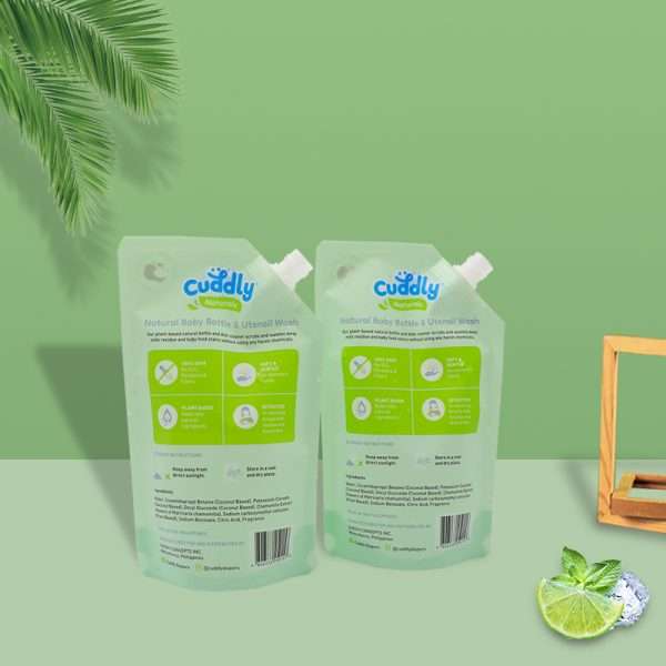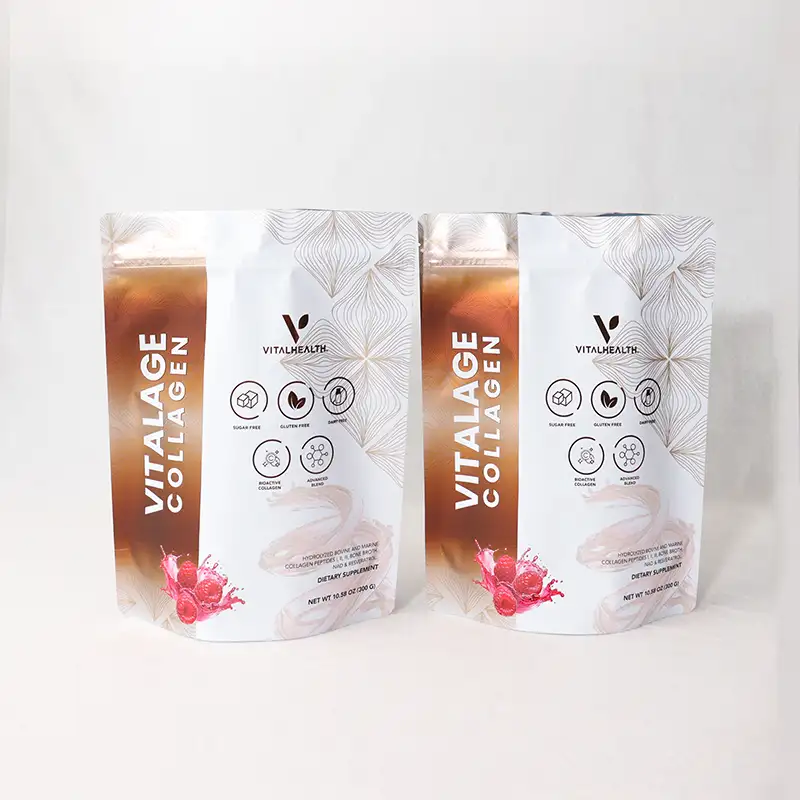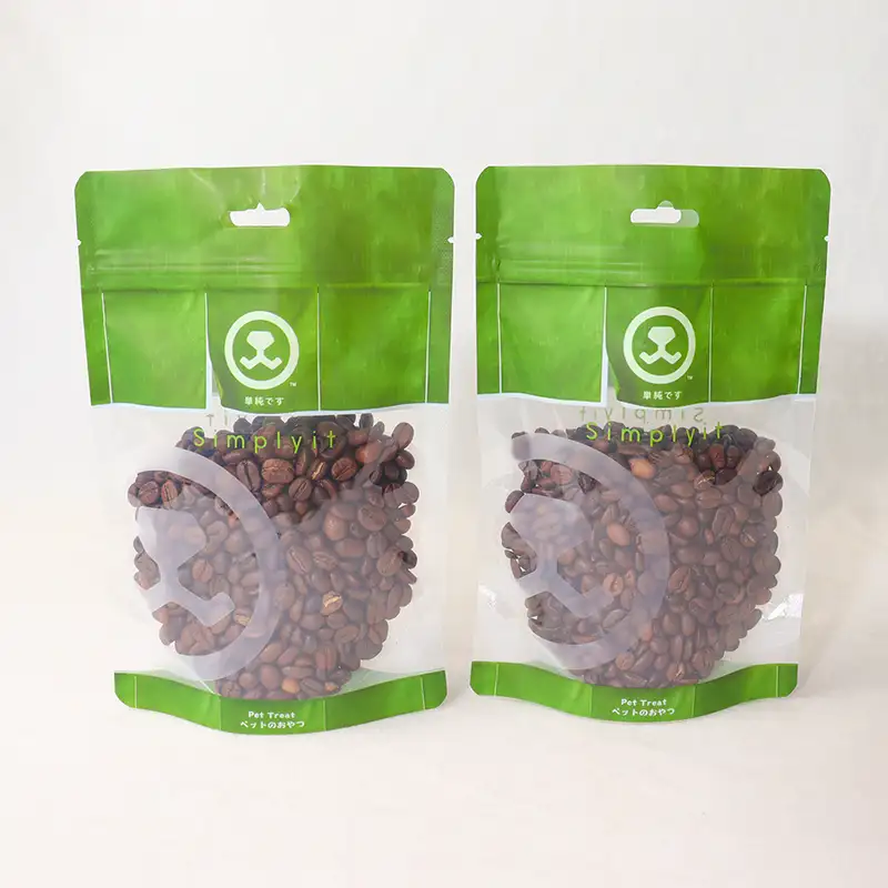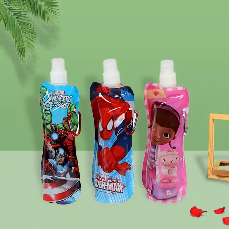

The Quick Answer: How to Print on a Spout Pouch
Here's the short version. To decorate a spout pouch, you supply a print-ready vector file (usually PDF or AI) with CMYK colors, embedded fonts, and a 3-5mm bleed, then choose between rotogravure, flexographic, or digital printing based on your order size. Digital works great for small runs and photo-heavy artwork, while gravure shines for large volumes and rich, consistent color.
Why Print Quality Makes or Breaks a Spout Pouch
A spout pouch does a lot of heavy lifting. It holds your product, survives shipping, and acts as your silent salesperson the moment a customer spots it. When the artwork is crisp and the colors pop, people trust what's inside.
Think about baby food, energy gels, or premium olive oil. Shoppers scan those shelves in seconds. Faded text or a washed-out gradient sends the wrong message about what's inside the package.
Working with brands across North America, we've found that the most common mistake isn't a bad design idea. It's a beautiful design saved in the wrong file format, which turns a great concept into a printing headache.
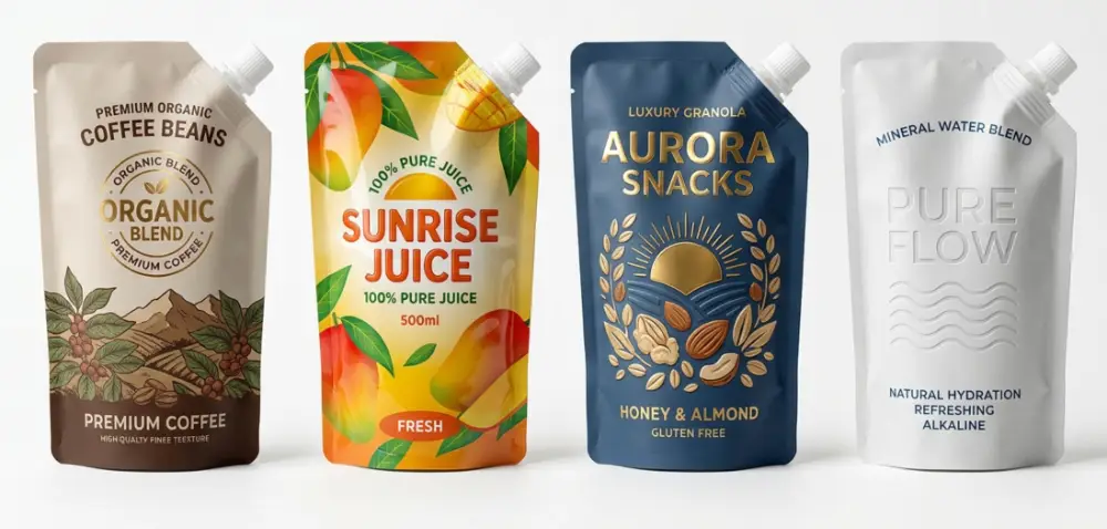
The Main Printing Methods Explained
Not every project needs the same approach. The right choice depends on your quantity, your artwork complexity, and how often you plan to reorder. Here's a breakdown of the three techniques you'll hear about most.
Rotogravure: The Workhorse for Big Runs
Gravure uses engraved metal cylinders to transfer ink. The setup takes time and the cylinders cost more upfront, but once you're rolling, the per-unit quality and speed are hard to beat.
This method delivers deep, saturated colors and razor-sharp detail. It's the go-to when you're ordering tens of thousands of units and color consistency across every batch matters.
Flexographic: The Flexible Middle Ground
Flexo uses flexible photopolymer plates and dries ink fast. It's a solid pick for medium volumes and simpler designs with solid color blocks rather than intricate photographic gradients.
Setup is quicker and cheaper than gravure, so it hits a nice balance for growing brands that reorder regularly but aren't at massive scale yet.
Digital: Fast, Flexible, No Plates
Digital printing skips plates and cylinders entirely. That means no tooling costs, quick turnaround, and the freedom to print short runs or even variable designs within a single order.
If you're launching a new flavor, testing a market, or need photo-realistic imagery, digital printing on spout pouch packaging is often the smartest starting point. The catch is that per-unit cost stays higher as volumes climb, so it's less economical for very large orders.
A Side-by-Side Comparison
| Method | Best Order Size | Setup Cost | Color Richness | Turnaround |
|---|---|---|---|---|
| Rotogravure | 30,000+ units | High | Excellent | Longer |
| Flexographic | 10,000-50,000 units | Medium | Very Good | Moderate |
| Digital | 500-10,000 units | Low / None | Very Good | Fast |
Use these ranges as a guide, not gospel. The sweet spot shifts based on your specific artwork and material choices, which is exactly the kind of thing worth talking through before you commit.
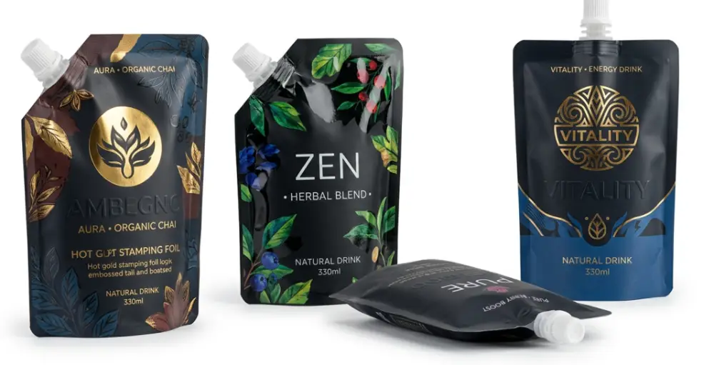
File Requirements That Keep Your Design On Track
This is where projects either sail through or stall. Getting your artwork file right the first time saves days of back-and-forth and protects your launch date. Here's what a print-ready file actually needs.
Use Vector Formats Whenever Possible
Vector files scale to any size without losing sharpness. For logos and text, formats like AI, EPS, or a high-quality PDF are ideal. Raster images (JPGs, PNGs) can work for photos, but they must be high resolution.
Mind Your Resolution
Any placed image should be at least 300 DPI at the final print size. A logo pulled from a website is usually 72 DPI, which looks fine on screen but turns fuzzy once it's blown up on a pouch.
Work in CMYK, Not RGB
Screens display in RGB, but printing presses use CMYK inks. If you send RGB files, those vivid blues and greens can shift unexpectedly. Convert to CMYK early so what you approve is what you receive.
Add Bleed and Safe Zones
Include 3-5mm of bleed beyond the trim line so no white edges appear after cutting. Keep important text and your logo at least 3mm inside the trim to avoid awkward crops near the seams and spout.
Embed or Outline Your Fonts
If fonts aren't embedded or converted to outlines, they can reflow or substitute on our end. Outlining text turns it into a shape, guaranteeing it prints exactly as you designed it.
Quick File Checklist
- Vector format (AI, EPS, or press-ready PDF)
- 300 DPI minimum for any embedded images
- CMYK color mode (with Pantone references if exact matching matters)
- 3-5mm bleed on all sides
- Text and logos inside the safe zone
- Fonts embedded or outlined
- Die line included on a separate layer
Our in-house design team often helps brands who only have a rough sketch or a low-res logo, so don't panic if your file isn't perfect yet. We'd rather fix it before the press runs than after.
Designing Artwork That Actually Sells
A print-ready file is step one. A design that stops thumbs and turns heads is the real goal. A spout pouch has curves, folds, and a spout that interrupts the print area, so flat mockups can fool you.
Design for the Shape, Not the Screen
Always place your artwork on the actual die line. That spout sits at the top, and the bottom gusset expands when filled. Text placed too close to either can distort or disappear once the pouch is full.
Keep Your Logo Where Eyes Land
Learning how to print logo on stand up spout pouch designs well means respecting the natural focal point. On a stand-up style, that's the upper-middle panel at eye level. Anchor your brand mark there for maximum recognition.
Match Your Finish to Your Product
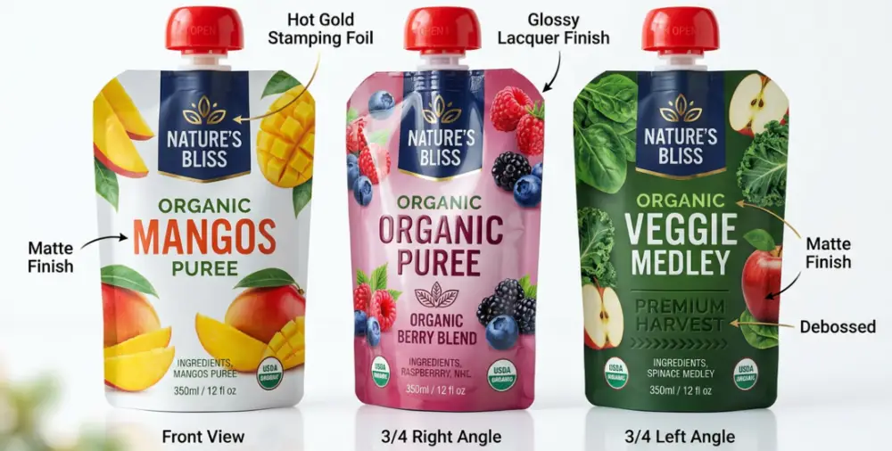
A matte finish reads as premium and natural, which suits organic snacks or skincare. Glossy pops on candy and beverages. Spot varnish or a soft-touch coating can highlight a logo and make that first unboxing moment feel special.
In our 6,800㎡ cleanroom facility, we've seen that a smart finish choice often does more for shelf appeal than an extra color. It's about texture, not just imagery.
Industry-Specific Design Tips
Every product category has its own quirks. Understanding them upfront saves reprints and keeps your customers happy. Here are a few we run into often.
Food and Beverage
For coffee and specialty drinks, barrier performance matters as much as looks. A strong oxygen barrier protects aroma and freshness, so pair your artwork with the right laminate structure. Nobody wants gorgeous packaging protecting stale product.
Pet Food and Treats
Pet owners scrutinize ingredients like they're reading their own labels. Give ingredient panels and sourcing claims clear, legible space. Transparency on the pack builds the trust that turns a first purchase into a repeat one.
Beauty and Personal Care
For serums, masks, and lotions, the unboxing moment lives on social media. Design with that photo in mind. Clean typography, tactile finishes, and a hero color that reads well on a phone screen all earn shares and tags.
Liquids and Baby Food
These products lean on trust and clarity. Because we hold FDA and ISO 22000 certifications, we recommend keeping safety and usage info highly readable, never buried under decorative elements. Clarity here is both a design and a compliance win.
Can You Print a Spout Pouch at Home?
People ask this a lot, so let's be honest about it. Figuring out how to print spout pouch at home is possible for tiny craft batches using blank pouches and printable labels or a small inkjet setup. It's fine for a farmers market or a prototype.
But for anything you plan to sell at scale, home methods fall short on durability, color accuracy, and food-safety compliance. Labels peel, home inks smudge, and food-contact standards are hard to guarantee. For a real launch, factory decoration is the dependable route.
From File to Finished Pouch: What to Expect
Knowing the workflow helps you plan your timeline. Here's a typical path once your design is ready to move.
- File review: We check resolution, color mode, bleed, and the die line fit.
- Digital proof: You approve an on-screen mockup placed on the real shape.
- Physical sample: For larger orders, a printed sample confirms color and material feel.
- Production: Your chosen method runs, with color checks along the way.
- Quality check and shipping: Pouches are inspected before they head your way.
As a manufacturer that has produced packaging for over 20 years, we've learned the proof stage is where you catch surprises. Approving a physical sample beats discovering a color shift after 20,000 units are printed.
Common Mistakes to Sidestep
A few recurring issues cause most of the delays we see. Avoid these and you're already ahead.
- Sending RGB files: Colors shift on press. Convert to CMYK first.
- Low-res logos: That 72 DPI web logo won't hold up when enlarged.
- Ignoring the spout area: Artwork placed under the spout gets cut or hidden.
- No bleed: White slivers appear at the edges after trimming.
- Skipping the proof: Rushing past the sample stage risks costly reprints.
Mastering how to print custom designs on spout pouches is really about catching these small things early. The design is the fun part; the file prep is what protects it.
Choosing the Right Partner for Your Packaging
Once your artwork and method are sorted, the manufacturer you work with shapes the final result. Look for a few things beyond price.
Ask about certifications for your product type, request physical samples before committing, and confirm they have design support if your files need help. When weighing the best printing methods for spout pouch packaging, a partner who explains tradeoffs honestly is worth more than one who just says yes to everything.
At YLTPACK, our source-factory setup means the design team, print floor, and quality checks all sit under one roof. That keeps communication tight and problems small. If you want a second set of eyes on your files, reach us at [email protected] or on WhatsApp at +86 182 1944 5665.
Key Takeaways
Getting decoration right comes down to three things: choose a method that matches your volume, prep a clean vector file with CMYK, bleed, and outlined fonts, and design for the pouch's real shape rather than a flat screen.
Nail those, approve a physical proof, and lean on your manufacturer's design support when you need it. Do that, and your packaging will look every bit as good in a customer's hands as it did in your imagination.
Frequently Asked Questions
What file format should I send for the sharpest print?
A press-ready PDF or a native AI/EPS vector file is ideal. Vectors stay crisp at any size, keep your text sharp, and make color adjustments easy. If you include photos, make sure they're 300 DPI at final size.
How many colors can I print on one pouch?
It depends on the method. Gravure and flexo typically handle up to 8-10 spot colors, while digital prints full-color CMYK plus photo imagery with no color-count limits. For exact brand matching, provide Pantone references.
Why do my colors look different from my screen?
Screens use RGB light while presses use CMYK ink, so some shades naturally shift. Designing in CMYK from the start and approving a physical sample is the reliable way to get colors you're happy with.
What's the smallest order I can decorate?
With digital printing, short runs of a few hundred to a couple thousand are very doable, which is great for launches and market tests. Gravure and flexo make more sense once volumes climb into the tens of thousands.
Can you fix my logo if it's low resolution?
Often, yes. Our in-house design team can redraw or vectorize many logos so they print cleanly. Send us what you have, and we'll tell you honestly whether it's usable or needs a rebuild before production.